Does anyone else think that the quality of the actual printed text of the hardcover edition of Four Past Midnight -- at least the edition that hit the bookstores when it was first released in 1990 -- is different than King's other hardcovers, and that it is in fact the best looking of all of them? For some reason, the text seems more bold and attractive than any other King book. This is something I've always thought and wondered about.
I don't have the hardcover in front of me, but if I recall, the font that was listed on the information page (not sure what the technical name is for that page, but for wont of a better term, I'll call it the information page) went something like "Set in Garamond No. 3 and...something else." Usually, didn't the hardcovers at the time just say "Set in Garamond No. 3?" I'm wondering if this accounts for the difference.
Yet, it's strange -- if you put, say, It and Midnight together for a comparison, the text essentially looks to have the same quality. But looking at them separately, there is just something about how the text looks in Midnight that I've always loved; I always said to myself, if I ever had a book published, I would love my words to be printed in that exact same way.
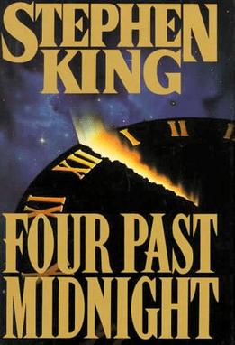
The entire book is, in fact, good-looking. The cover is one of my favorites -- besides the theme being a perfect reflection of the contents inside (and of the title, naturally), I absolutely love the illustration and the colors, especially the blues. It's simply gorgeous to look at, it's like the Kate Upton of King covers.
If anyone else noticed that the printing quality of the text of Midnight seemed somehow different, please let me know, as I've always been curious about this.
I don't have the hardcover in front of me, but if I recall, the font that was listed on the information page (not sure what the technical name is for that page, but for wont of a better term, I'll call it the information page) went something like "Set in Garamond No. 3 and...something else." Usually, didn't the hardcovers at the time just say "Set in Garamond No. 3?" I'm wondering if this accounts for the difference.
Yet, it's strange -- if you put, say, It and Midnight together for a comparison, the text essentially looks to have the same quality. But looking at them separately, there is just something about how the text looks in Midnight that I've always loved; I always said to myself, if I ever had a book published, I would love my words to be printed in that exact same way.
The entire book is, in fact, good-looking. The cover is one of my favorites -- besides the theme being a perfect reflection of the contents inside (and of the title, naturally), I absolutely love the illustration and the colors, especially the blues. It's simply gorgeous to look at, it's like the Kate Upton of King covers.
If anyone else noticed that the printing quality of the text of Midnight seemed somehow different, please let me know, as I've always been curious about this.