Oh, very good! Maybe the images should be reversed?? I'd have to see it all finished up.Dana Jean - there is a design like Brian's on Zazzle which has blood splatter behind one of the mallets/ also one that has blood splatter in the middle- it may be do to artistic copyright laws that the blood can not be used.
Brian does have "the shine"in the center. This is only the back of the tee/ the front will have the room key with blood dripping from it.
King Kon 2016
- Thread starter GNTLGNT
- Start date
-
This message board permanently closed on June 30th, 2020 at 4PM EDT and is no longer accepting new members.
You are using an out of date browser. It may not display this or other websites correctly.
You should upgrade or use an alternative browser.
You should upgrade or use an alternative browser.
I really like the design, but agree that maybe some blood dripping from one of the mallets, or some wasps flying around, will add additional creep factor.
yes.I really like the design, but agree that maybe some blood dripping from one of the mallets, or some wasps flying around, will add additional creep factor.
Do we need the year 2016 somewhere on the shirt? Maybe under Colorado?
for sure the year has to be thereDo we need the year 2016 somewhere on the shirt? Maybe under Colorado?
I think that was supposed to be covered with the room key--here's what Scott had posted
"....then on the front left breast a blood dripping key with 2016 on it"
"....then on the front left breast a blood dripping key with 2016 on it"
I think that was supposed to be covered with the room key--here's what Scott had posted
"....then on the front left breast a blood dripping key with 2016 on it"

Okay, JMO and no disrespect as I know how much work goes into this designing stuff, but to me, this shirt looks like a Polo match. I would want something a little more graphic and in my face Stephen King.
It's ok Dana, speak freely... Let's get this right. How can we add a bit of dark flavor that works with the mallots? Marsha?
BTW: It's supposed to look preppy stupid.

Needs to be 2016 instead of 216.

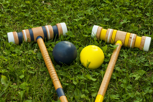
For me, it's the color of the mallets that isn't ringing true. They should look more like wood and have different bands of color--the ones in the other picture with one yellow and one green are more like the mallets I'm used to seeing.It's ok Dana, speak freely... Let's get this right. How can we add a bit of dark flavor that works with the mallots? Marsha?
BTW: It's supposed to look preppy stupid.
Pardon. had a bit of an export issue. 2016 Should display correctly now. ")
Gonna work on the realism of the mallets. Will report back soon.
For me, it's the color of the mallets that isn't ringing true. They should look more like wood and have different bands of color--the ones in the other picture with one yellow and one green are more like the mallets I'm used to seeing.
Yes, the yellow and green colors. Maybe think of the mallets as a tree branchs- grain added, of even smudges, like burnt ashes rubbed on the what Brian has ( think fire at hotel )
Looking good!!
...Dude these are quite simply friggin' awesome!...I agree with the suggestion on the mallets, the key is perfect and leave the SKMB "graffiti"...actualy a spray paint font, on the SKMB piece would give it that Bango Skankish je ne sais quoi...this is great work man....Gonna work on the realism of the mallets. Will report back soon.
yes, wood grain, a little more battered looking, smudgy. They just look too pristine.Yes, the yellow and green colors. Maybe think of the mallets as a tree branchs- grain added, of even smudges, like burnt ashes rubbed on the what Brian has ( think fire at hotel )
Gonna work on the realism of the mallets. Will report back soon.
Thanks, Brian. These look really great.
I forgot to mention that the key will be small and an the left breast pocket area. You're seeing the large HD version for printing.
Hey Everyone,
At the link below you will find the design for the back of the shirt. Please let me know if you have any suggestions or changes. Also, I included a secondary version that has a tag line. I used "SKMB for life" as a good example. You guys can decide on the tag if you wish or we can leave it out.
I'm working on the front of the shirt now.
Untitled Document
(Be sure to scroll down to see al the images)
I thought the same thing. It's gorgeous, but too clean. Polo or croquet. I wonder if we could add a spattering of blood as well. We need to take our medicine, after all.Okay, JMO and no disrespect as I know how much work goes into this designing stuff, but to me, this shirt looks like a Polo match. I would want something a little more graphic and in my face Stephen King.